Fakten
Signs for eternity – atomic semiotics with ISO 21482
2025-04-11
Imagine you had to create a warning that would be understood for 10,000 years. Not only by future generations, but perhaps by people who no longer think or speak like us – or are even human at all. Welcome to the fascinating field of atomic semiotics!
Atomic semiotics?
Atomic semiotics deals with a potentially impossible task: how do we mark storage sites for highly radioactive waste in such a way that someone in the distant future will understand – hands off, this is dangerous! The term is made up of “atom” (clear) and “semiotics”, the science of signs and meaning.
The problem: time and understanding
Nuclear waste remains dangerous for thousands of years – much longer than our languages, cultures or governments have lasted. While 2,000-year-old languages are already difficult to decipher, a warning about a repository should be clear for ten times longer. Characters? Pictures? Sculptures? Or would you prefer a myth that creeps through the generations like a dark legend?
The solution: creativity plus science
In the 1980s, the “Human Interference Task Force” project was set up in the USA to address precisely this issue. Their ideas ranged from sinister landscaping – such as black, repellent fields of thorns made of concrete – to cats that change color when radioactivity is in the air. No joke. The plan: to develop a culture around these animals that point to the invisible.
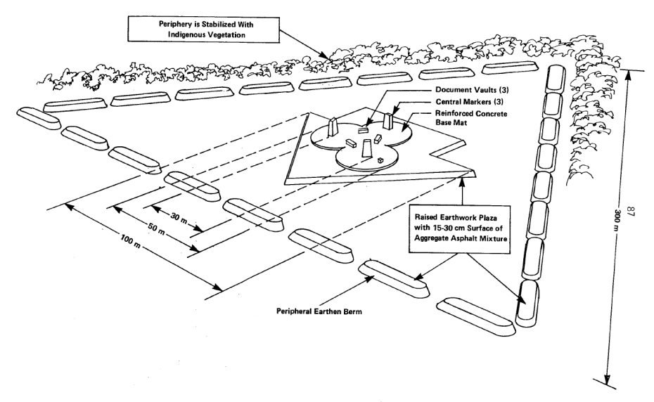
Draft for the large-scale marking of a nuclear repository
The solution: warning signs
Ionizing and radioactive radiation are invisible to humans and can cause considerable damage to health. It is therefore essential to provide effective warning of such sources of danger. Over time, specific warning signs have been developed to draw attention to the presence of this radiation and to protect people from potential dangers. The warning sign W003 from ISO 7010 “Warning of radioactive substances or ionizing radiation” is almost a classic.
The warning sign is based on the best-known symbol for radioactivity, the radiation warning sign or trefoil. It was designed in 1946 at the University of California at Berkeley and originally consisted of three equilateral triangles touching at one point in magenta on a blue background. The background was later changed to yellow to increase visibility. Exactly how the radiation warning sign came about is a matter of assumption. The obvious explanation is that the circle in the middle of the trefoil represents an atom and the blades represent the three common types of ionizing radiation emitted from it – alpha (α), beta (β) and gamma (γ). The background is a weak consolation, because they do not release the symbol from its abstractness.
This symbol is now used worldwide and is standardised in ISO 361 ‘Basic symbol for ionising radiation’ and also listed as a warning sign in ISO 7010. It can be found on containers with radioactive materials, on the doors of rooms with radiation sources and in places that are intended to warn against ionising radiation.

Warning sign W003 from ISO 7010 based on ISO 361
“Warning of radioactive substances or ionizing radiation”
Despite the widespread use of the traditional radiation warning sign, it became obvious that the symbol was not always interpreted correctly, particularly in certain regions and by people without specific knowledge. In order to increase comprehensibility, the International Atomic Energy Agency (IAEA) introduced a supplementary warning sign in 2007, which is defined in ISO 21482 “Ionizing-radiation warning — Supplementary symbol”. This symbol combines the traditional warning sign with additional elements such as a skull and crossbones and escape arrows to communicate the danger more clearly. It is intended to be placed directly on dangerous radiation sources to warn laypersons of the potential danger.
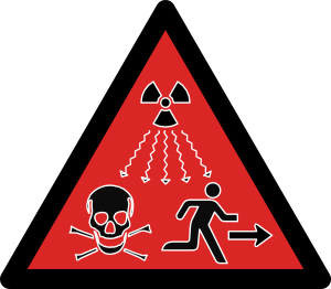
Ionizing-radiation warning — Supplementary symbol from ISO 21482
After various accidents involving radioactive radiation (Goiânia accident, Brazil, 1987 or nuclear accident in Samut Prakan, Thailand, 2000), the IAEA together with the ISO saw a need for action for this additional warning sign. However, the result is somewhat special:
- The problem of the non-visualizable danger (radioactivity) remained and the trefoil was again used as a symbol for the danger.
- In contrast to the ISO 3864 series, red was chosen as the background color, probably to emphasize the danger.
- It was probably when they realized that the contrast ratios suffered under the red/black colour combination that they decided to use a white outline around all objects, again deviating from the ISO 3864 series.
- In addition to the danger shown (radioactivity with the trefoil and death with skull and bones), which is intended for warning signs, there is also a mandatory action in the basic symbol (run away and arrow). Many statements in the limited space of a warning triangle, so that their graphic elements are accordingly small. And again contrary to the ISO 3864 series; only one statement per symbol.
Due to the size of the graphic elements, it would be difficult for the safety sign to pass a visual quality test in according to ISO 9186-2 (Graphical symbols — Test methods — Part 2: Method for testing perceptual quality), in which elements of safety signs measuring 50 x 50 mm must be correctly and completely recognized and described by 90% of the respondents at a distance of 2 m.
The creators of the ISO 21482 safety sign were obviously aware of this, as the standard emphasizes that the safety symbol W003 from ISO 7010 “Warning of radioactive substances or ionizing radiation” should not be replaced and that the additional safety sign should be placed directly on the very small radiation sources and under a possible device cover. This puts the viewing distance into perspective from an application perspective, but is paradoxical from a hazard perspective; a large distance is essential, but this can only be recognized at a short distance.
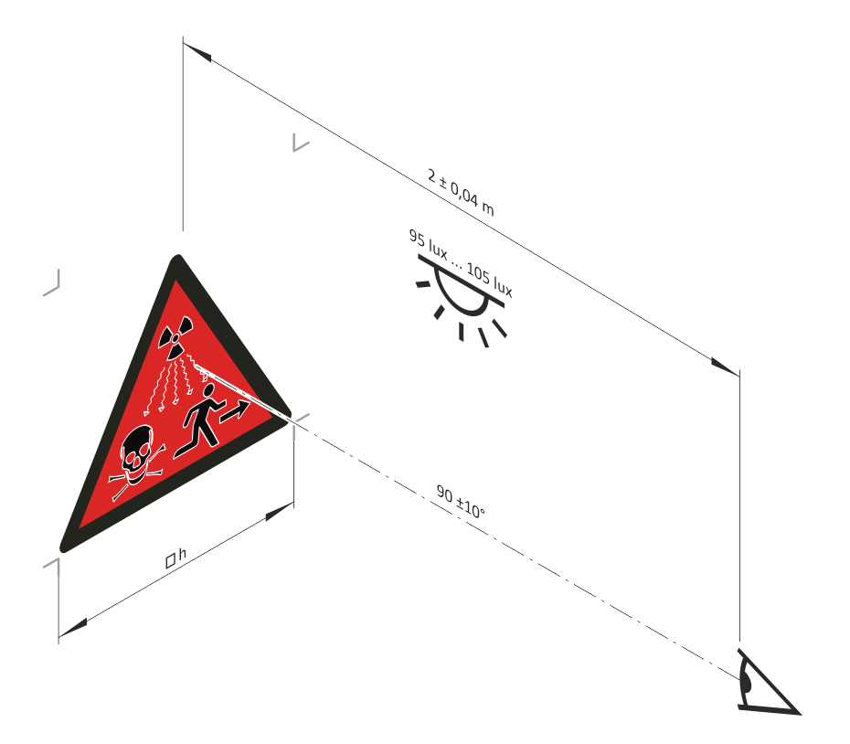
Test arrangement according to ISO 9186-2
The safety sign was tested together with other variants by the GallupOrganization (www.gallup.com ) in 11 countries (Brazil, Mexico, Morocco, Kenya, Saudi Arabia, China, India, Thailand, Poland, Ukraine and the USA) with a total of 1650 participants. The test results and test method are not public. What is known, however, is that a danger was always detected, but not the type of danger. The “skull” element was the strongest message. Surprisingly, the test results showed no significant differences in terms of culture, gender, age and education. Gallup is one of the world’s leading market and opinion research institutes and will certainly have used professional methods, but only tests in accordance with the ISO 9186 series provide the opportunity to evaluate results.
Challenges of atomic semiotics
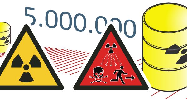
Warnings of dangers should and must last as long as possible. In this case, long-lasting means durable and comprehensible for a long time. In the context of radioactive radiation, we are talking about 20,000 to 5,000,000 years, depending on which national authority is responsible. If we assume about 5,000 years of human cultural history, it is no longer important whether the time periods are standards-based or not, it is only a matter of setting or hoping for a minimum chance of comprehensibility. That is the core of atomic semiotics.
In this context, the non-conformance to standardized conventions for the safety sign “Ionizing-radiation warning — Supplementary symbol“ according to ISO 21482 is irrelevant.
Symbols for download
Safety signs according to ISO 361 and ISO 21482
Symbols „Ionizing radiation symbol“ as CSL
Corel symbol library for Draw and DESIGNER from version 25 and
Corel Stylesheet CDSS for efficient modification of object properties.
If you are working with a higher Corel version,
first open the CSL and save it in the Corel version you are using.
Symbols „Ionizing radiation symbol“ as PDF
Symbols „Ionizing radiation symbol“ as PNG
Symbols „Ionizing radiation symbol“ as SVG